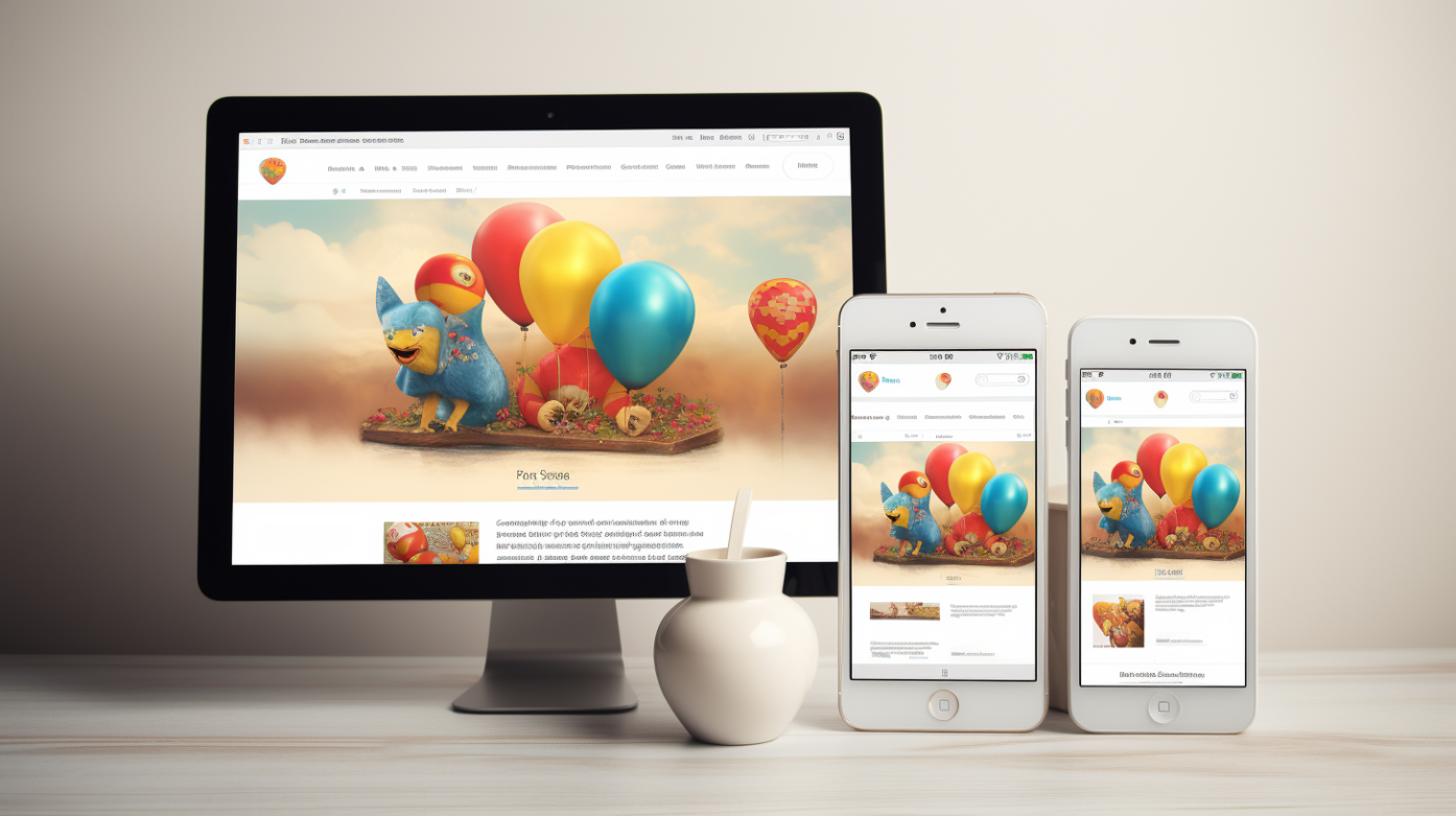
Having a responsive website is not just a luxury—it’s a necessity. With the majority of users accessing websites through portable devices, it’s crucial to ensure your site is optimized for all screen sizes. Traditional desktop websites may appear distorted or be difficult to navigate on smaller devices, potentially alienating a significant portion of your audience.
Statistics show that more than 50% of users browse websites on mobile devices, highlighting the importance of catering to this user trend. Furthermore, Google recognizes the significance of responsive design and rewards responsive websites with better search engine rankings.
If you’re looking to update your website and create a versatile business tool that performs seamlessly across all devices, our design team is here to help. We specialize in creating cost-effective, performance-driven solutions that will elevate your online presence and enhance user experience.

The concept of responsive web design has become increasingly prevalent. Especially for mobile phones! Almost every website we encounter is designed to adapt seamlessly to various screen sizes and devices. However, if you’re still hesitant to embrace responsive design for your website, you could be overlooking valuable opportunities for your business.
In this article, we will go through the reasons “Why You Need a Responsive Website.”
During my pursuit of a Management Information Systems degree, I found myself managing a quaint apartment complex alongside my wife. Nestled amidst a serene, park-like setting, our neighbors exuded tranquility, creating an idyllic atmosphere. Our daily routine involved overseeing operations from the comfort of our living room, which conveniently doubled as our office thanks to a sliding glass door.
Despite our limited office hours, our residents were content, and our occupancy rates remained high. With spare time on my hands, I began brainstorming entrepreneurial endeavors, eventually giving birth to SiteHatchery — a testament to innovation born from humble beginnings.

My inaugural foray into web design occurred within the confines of a modest office space, armed only with a Windows XP computer boasting a diminutive 14-inch monitor. Frustration quickly set in as I grappled with the sluggish internet connection and the cramped screen real estate.
If your own experience with computers dates back to the early 2000’s, you might remember working with something like this:
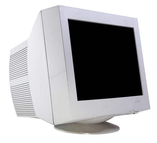
The monitor itself was a formidable presence, akin to an unwieldy anvil, dominating half the desk with its sheer bulk. In an era where larger, sleeker screens commanded a premium, I resigned myself to making do with what I had. If you too have fond (or not-so-fond) memories of computing in the early 2000s, you might empathize with this nostalgic recollection.
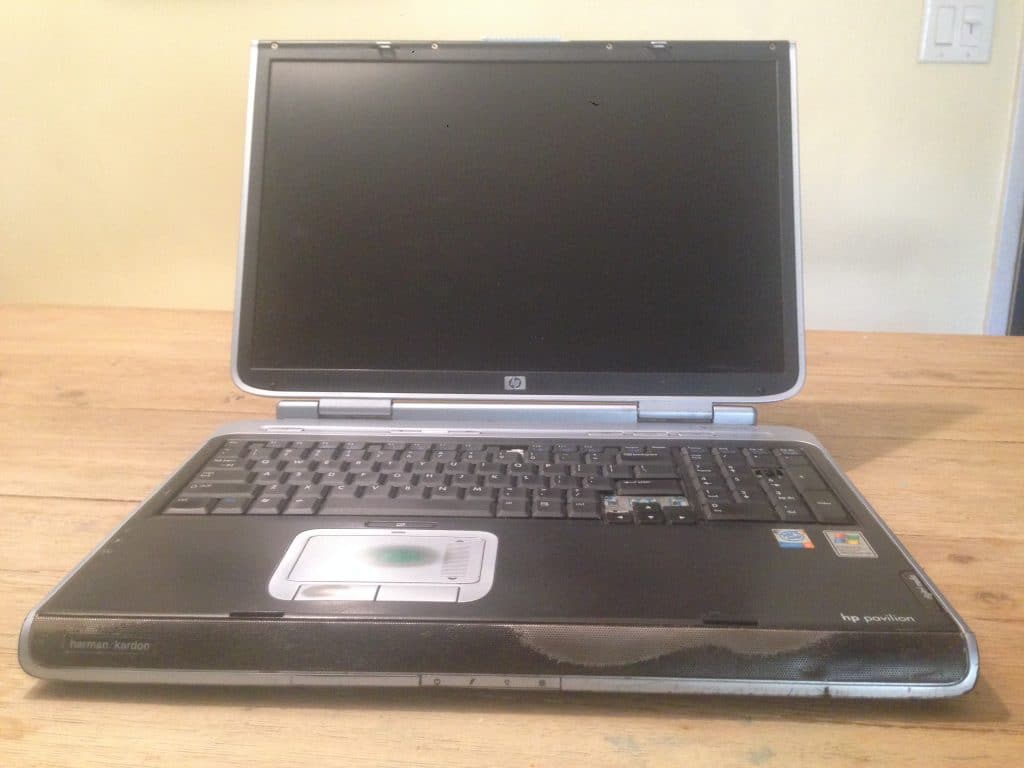
My parents heard of the struggle and wanted to help encourage my decision to start a business. To my great delight, they bought a laptop computer to replace the relic I had. It was a large 17 inch HP laptop. It was heavy, but portable. There was so much extra room for designing and developing websites, and it was also nice to meet with customers remotely and do work in coffee shops.
Here’s a picture of the actual laptop I was given when I graduated in 2004, now used by my kids as an inoperable toy:
While I prefer using larger monitors, many of you may like to use smaller and more portable computers. Several years ago, Best Buy only had a single 17 inch laptop in their store. It was a great shock to discover that the tiny 13 inch laptops were in such high demand and, according to the Best Buy rep, 17 inch laptops were becoming largely irrelevant.
In the early 2000’s, smart phones were trending. I upgraded a Palm 3C with a Blackberry smart phone. The full keyboard was amazing, and it was nice to be able to manage emails and a calendar from the device. Websites were shown slimmed down to a mobile site and were hardly usable. Browsing the internet was such a horrible experience that I didn’t do it much.

Then, something amazing happened. My mother-in-law presented the best birthday present: an iPhone. I dreamed of this, thinking how amazing it would be to show full desktop-like websites to clients on a small screen wherever without having to pull out a mammoth laptop.
Coincidentally, with the surge in popularity of smaller screens, the concept of responsive websites emerged. The rise of responsive design gained significant traction not too long after.
The idea behind scaling and reorganizing a website to fit smaller screens was introduced in May of 2010 by Ethan Marcotte in his A List Apart article. It began to take off in 2012! Now, having a responsive website is a requirement for every new web design project.
Keep in mind, SiteHatchery.com offers a variety of services tailored for business owners.
From web hosting, to custom analytic reports and intense security measures – SiteHatchery.com is an active ingredient when it comes to the recipe of successful web support.