Whats the Target?
As a new organization, a great mark used consistently helps to establish your presence in a community.
Criteria
Key Concept
To avoid overly church-y vibes, a simple letter mark is the best approach.
At the heart of Firm Family church is the idea of being connected. Blood or not, our church is family. Visually there are many different ways to communicate this approach.
Also in play is that the main initials of the name alliterate with “FF”.

Building the Icon
After doing some exploration, I thought it was interesting being able to create two interlocking F’s in a single letterform.
This is a compact and unique custom mark. Conceptually, it conveys the idea of being connected with fewer possibilities of negative connotations.
Building the Icon
The F by itself has rather sharp angles. To help soften up the overall image and add a touch of friendliness, I put the F in a circle container.
This also makes it easier to use the logo in different layouts without creating awkward negative space.

Scalability
Typography
With the icon set, the question shifts to how we write the name. With an icon so sharp and clean, I would recommend a softer font to create contrast.
The typeface Brandon Grotesque has a geometric structure with slightly rounded corners. That achieves a balance of being modern and friendly.
“Firm Family” is the most important part of the name to be read, so it is larger than “church”.

Configurations
Because the wordmark is separate from the icon, it is possible to have a flexible logo. For applications which require a horizontal space to be filled, a version with the icon to the left will be used. For applications which are more vertical in a nature, a stacked lockup will perform better.
Color
The color palette that I think would work the best has a pop of bright color with other muted neutrals.
This is a scheme that is modern and youthful. The bright blue is friendly and stands out in a sea of churches that have deep reds and blues as their color. Dark and light grey keep it rooted and from being too loud.
And of course, ample amounts of white help the colors to breathe a little bit.

Applications
![]()
![]()
![]()
LITTLE CHICO CREEK
ELEMENTARY SCHOOL
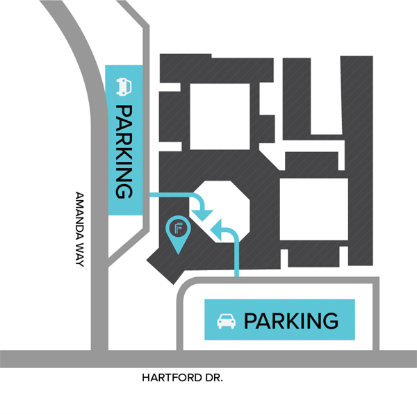
2090 Amanda Way
Chico, CA 95926