SiteHatchery’s Goal
The main goal of this project is to assist Site Hatchery as they pivot from focusing on custom software to beautifully designed and developed websites. Creating a visual identity that is modern, trustworthy, and distinguished is a must.
As an agency, the work we create for our customers is our brand identity. Our work is the “sentence” and the logo is the “period” punctuating what is being communicated.
The refreshed Site Hatchery logo should:
- 1. Speak to business owners, with a broad appeal of business types.
- 2. Directly compete with “do-it-yourself” options that many business owners are turning to.
- 3. Function in any environment and application, not just the top left corner of a website.
- 4. Increase distinctiveness, making a mark that is ownable by Site Hatchery.
Clients
Current:


Prospective:
Competition


Where do we go?
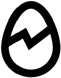
In order to improve upon the logo, we must first isolate what is working and what isn’t. The egg is the most valuable asset. It is appropriate on a conceptual level and should be retained.
The following outlines the key issues which must be addressed from a formal design perspective, and strategic standpoint.

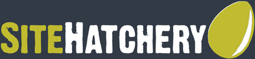
Text appears dirty, disorganized, and unprofessional. The texture limits the logo from scaling well.
![]()
The logo has an organic feel, which is more appropriate for an actual hatchery than a tech firm.
![]()
The form of the symbol and the style of the typography clashes, leaving both elements feeling out of place.

The combination of shape and color makes it difficult to read “egg”, and could be confused for an avocado.
![]()
The Egg is so large, it creates a very large negative space gap at the top.

There are many inconsistent uses of the egg which dilute it’s effectiveness.
![]()
The Egg’s most distinctive feature (rotation) is less effective on applications that don’t have an orientation.
![]()
The logo is not available in vector format, which causes the logo to lose quality when it is scaled up.
Egg Shape
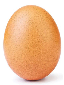
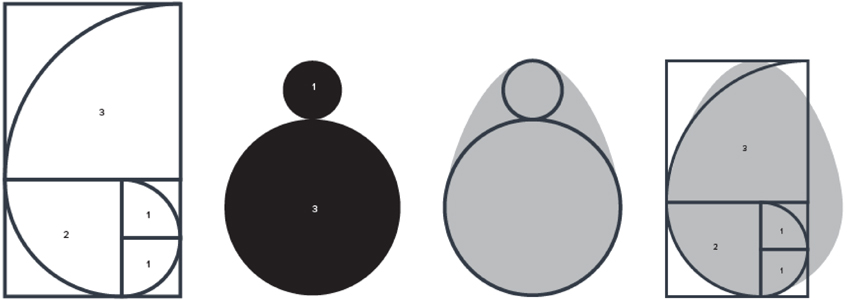
The egg is a great symbol for “new life”, and the idea of something fresh and new. Graphically, it can be evolved to more pleasing proportions.
While there is nothing “magical” about using the golden ratio, or “Fibonacci Sequence, it provides consistency and balance.A natural egg actually already follows this pattern.
Egg Refining
The basic form of the egg is set. But how do we make it identifiable and distinctive? We can’t rely solely on it’s rotation, so the best step to focus on is it’s silhouette.
The solution I have come up with outlines the egg,adds a hatch crack, and includes strategic cuts that create an abstract letter “S”,in reference to Site Hatchery.
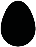
The basic egg shape. Optimized to be seen as an egg and not any other object.
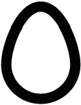
Using an outline is the first step to making the egg have a more distinct silhouette.
A simple but effective line implying the hatching. Using a lighting bolt shape for the hatch line implies speed and electricity
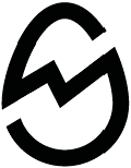
Withcutouts above and below the hatch line, an abstract letter “S” is created. Th is is a key feature that makes the logo ownable.
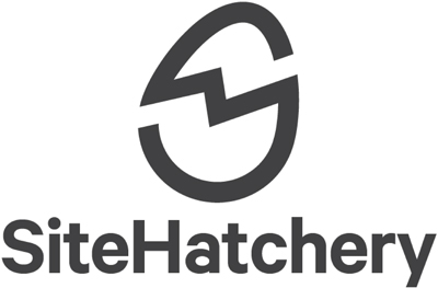
Typography
With the egg as the hero of the logo, it’s time to pair the name with the icon. The goal is to find something legible that pairs well with the egg.
To create repetition between the egg and the font, an oval font would be most pleasing. I chose Calibre by Klim Type Foundry.
It is very legible, has just a little but of quirkiness, but remains professional and trustworthy.

 Basic letterform – Oval
 Letters that reinforce the egg.
I chose to set the name in mixed case, with no spaces between the two different words. Using lowercase letters accentuates the “eggy” goodness of the ovular typeface.
Lockup
-
FIG 01. The font is weighted heavier than the egg, so the egg is not confused as a letter.

-
FIG 02. The egg is slightly larger in height than the name, so it is not confused as a letterform.

-
FIG 03. The egg is positioned at the end of the name, similar to the original.

-
FIG 04. The egg is rotated on the same axis of the diagonal of the “y”, enhancing harmony.

Alternate Lockup
Now that the uniqueness of the egg is not based solely on it’s position, it is possible to create variations in how the logo is locked up.
For applications which require a more vertical aspect ratio, the egg can be moved to the top of the wordmark.
Color
The current color palette is 16 functional with the new logo. However, I believe it can be evolved and improved.
The current shade of the egg has a strong green hue. This creates a couple of negative connotations. (Resemblance to an avocado, “Green eggs and ham” – meaning repulsive)
I would suggest moving to a more true yellow as a primary brand color, which is closely associated with eggs, and the chicks they hatch.
Color
This is a color palette that I would suggest. The yellow is bright, but able to contrast against both black and white.
The teal is complimentary to the yellow and serves as a great call to action color.
To help communicate the diversity of clients SiteHatchery serves, I suggest different egg shell colors. These help tone down any harshness created by a black and yellow primary palette.
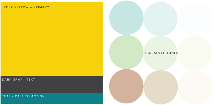
DARK GREY TEXT
YOLK YELLOW COLOR
EGGSHELL BACKGROUND
Graphic Language
Because the logo has more elements to it, there are more pieces that can be extracted and built upon in other areas of the identity. For example, I could see using “hatch lines” to create dividers.
Or using the egg shape as a container, and even have elements breaking out of it.
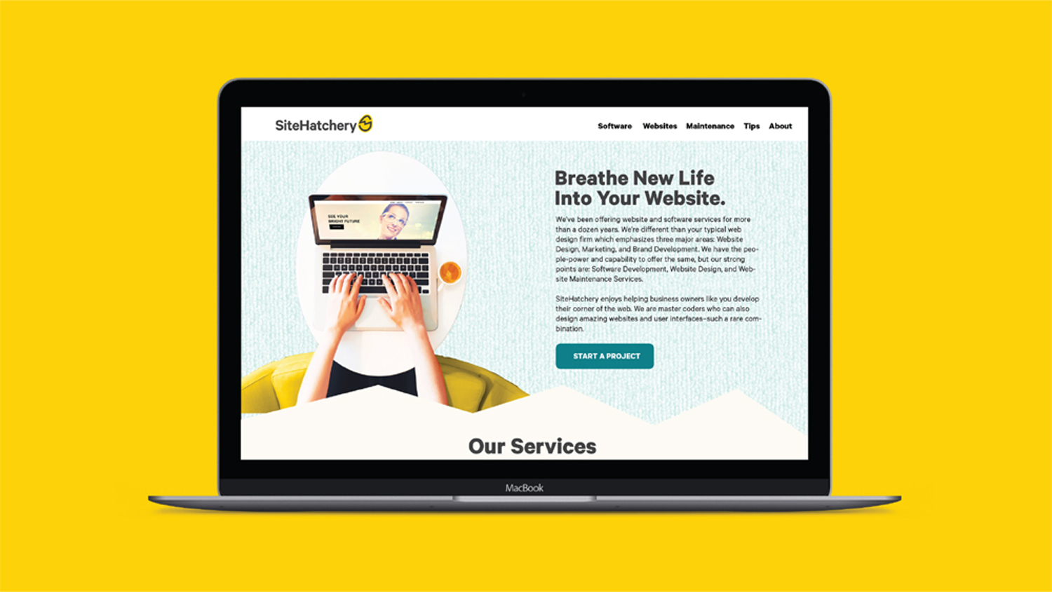
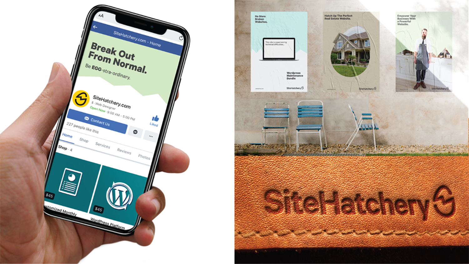
This is a mock series of posters showing how these new elements could be used.
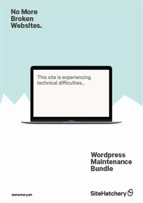


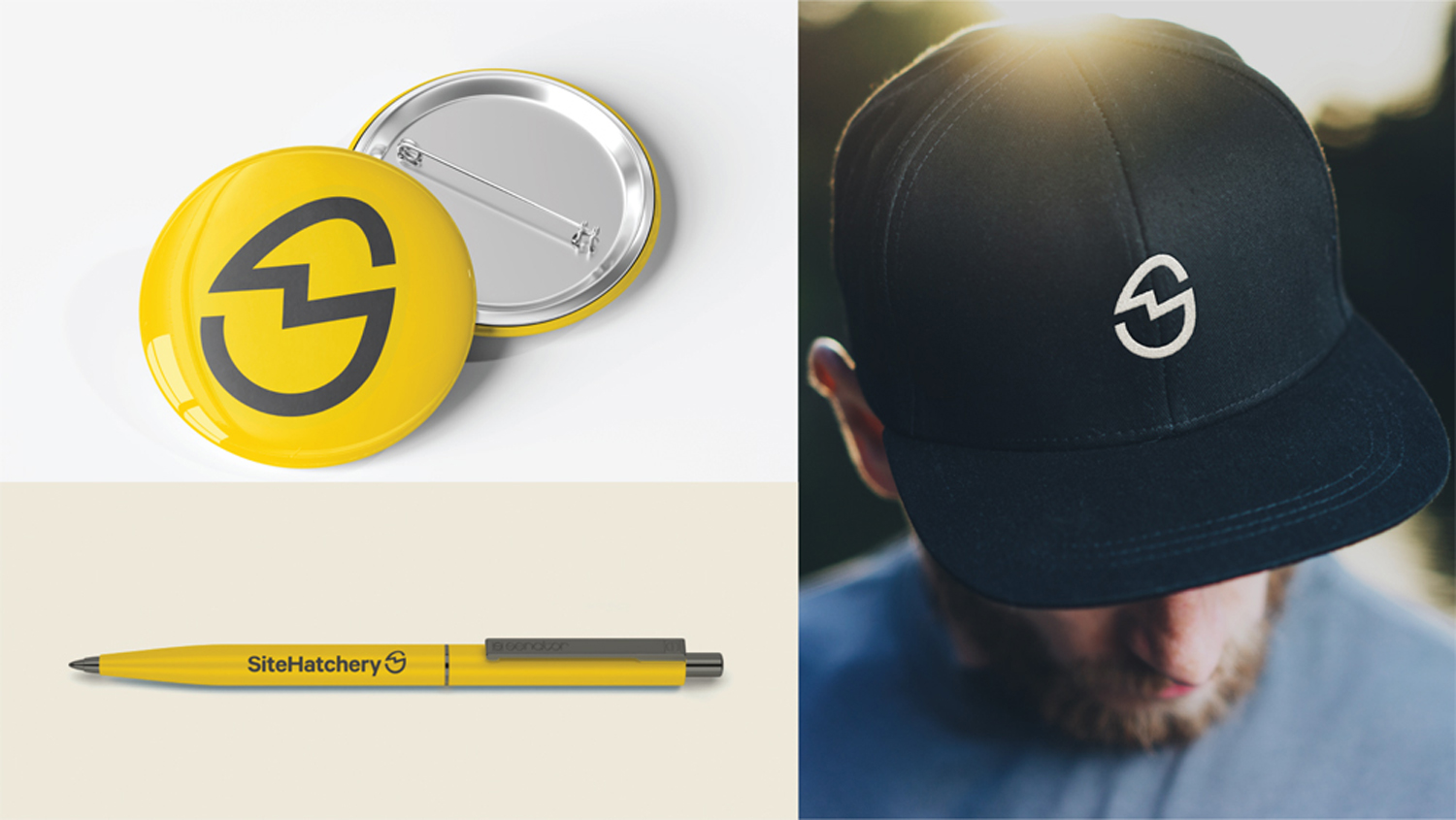
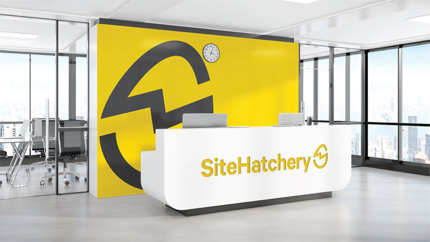
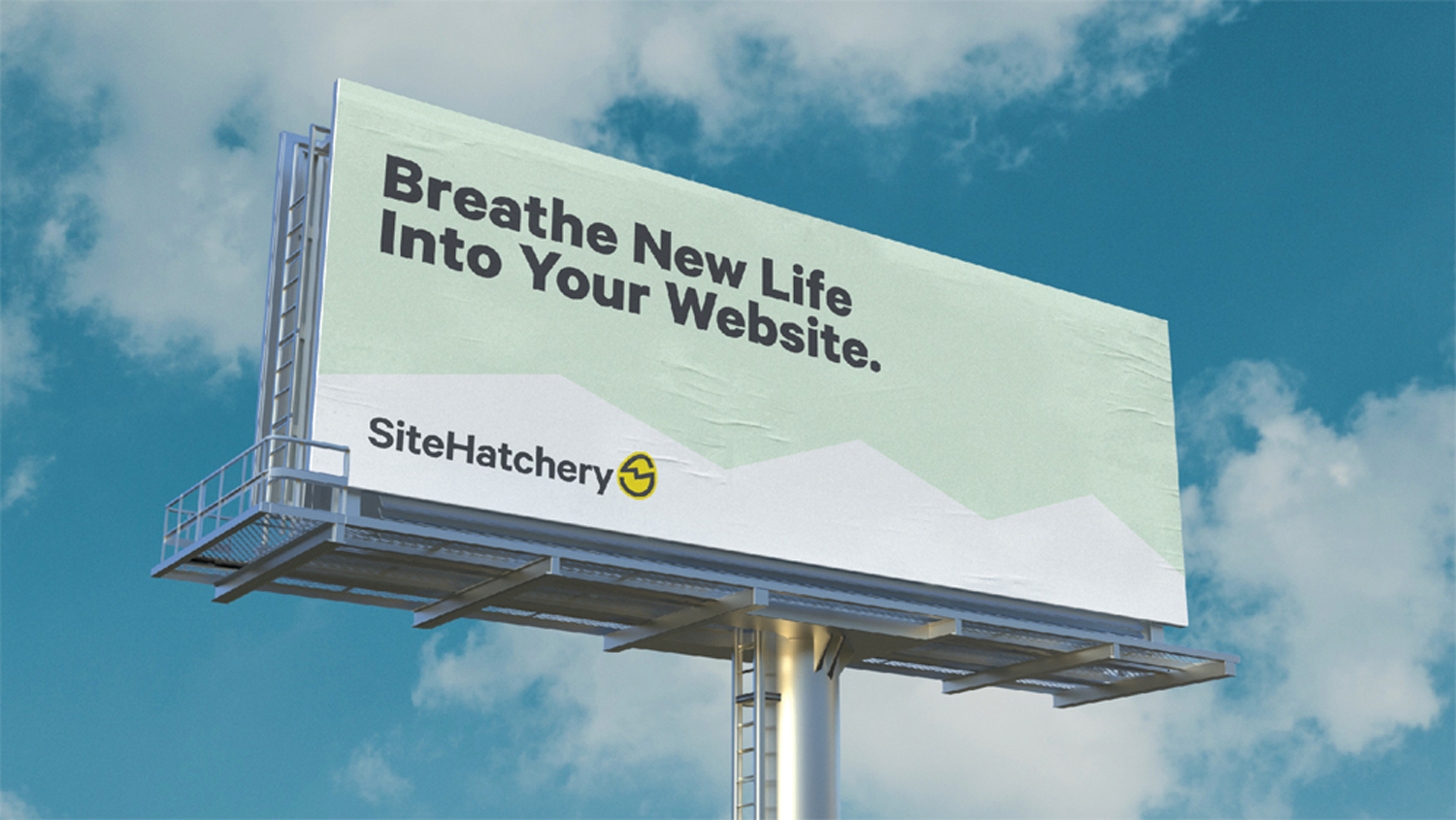
Mockups
The following slides represent what the logo and visual identity could look like in real use applications.
These are not necessarily polished final designs, but rather a way to see the flexibility of the system to expanded to the different key uses.
- BEFORE
- AFTER