
Tribal Roads Goal
The main goal of this project is to help Tribal Roadslaunch with a strong visual identity. When developing a logo, there are 3 criteria that make for an enduring timeless logo.
As an agency, the work we create for our customers is our brand identity. Our work is the “sentence” and the logo is the “period” punctuating what is being communicated.
Symbol
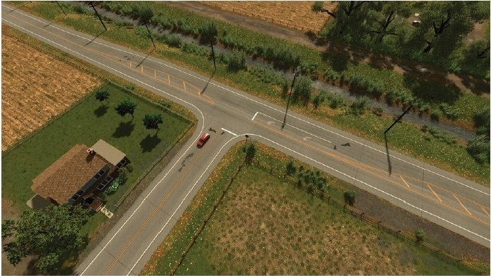
The idea that we kept coming back to in the design is an “intersection”. Tribal Roads uniqueness comes from an intersection of tribal relations, transportation consulting, and software.
The first initial of the company name “T” is commonly used to describe a type of intersection.
This serves as a starting point for what the logo could be.
-
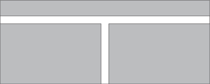
FIG 01.
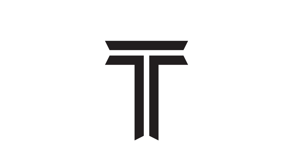
Basic T Shape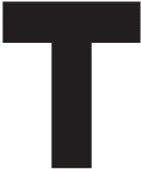 Using a “T” as the foundation I added a custom typography, style known as in-line.
 -
FIG 02.
In-line T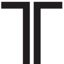 The “In-line T” represents a road intersection. This style of typography is commonly used to evoke a “tribal” feeling.
 -
FIG 03.
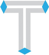
Fla red In- line T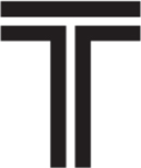 To help enhance the tribal feeling, a rhombus is used to create flared ends.
 -
FIG 03.
Fla red In- line T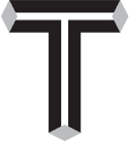 This symbol strikes a balance between tribal and roads in a simple yet sophisticated way.

Wordmark
With the symbol set, it’s time to move on to how the name appears. When there is a prominent symbol, of the best way to use feature the name is with a and complimentary typeface.
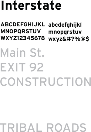
The typeface Ichose is called Interstate. It was designed based off of American road signage. It is sharp, legible, and appropriate for a company called “Tribal Roads”.
Interstate would be a great brand typeface, especially with it’s lowercases sharp angles similar to the symbol.
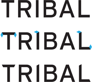
Wordmark
The wordmark typeset in Interstate is a great start. With some minor customization, it will be the perfect companion to the symbol.
Inspired by the flared ends of the symbol, any horizontal or verticalstoke in the wordmark has been adjusted to match the same angle.

Lockup
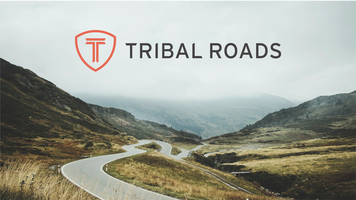
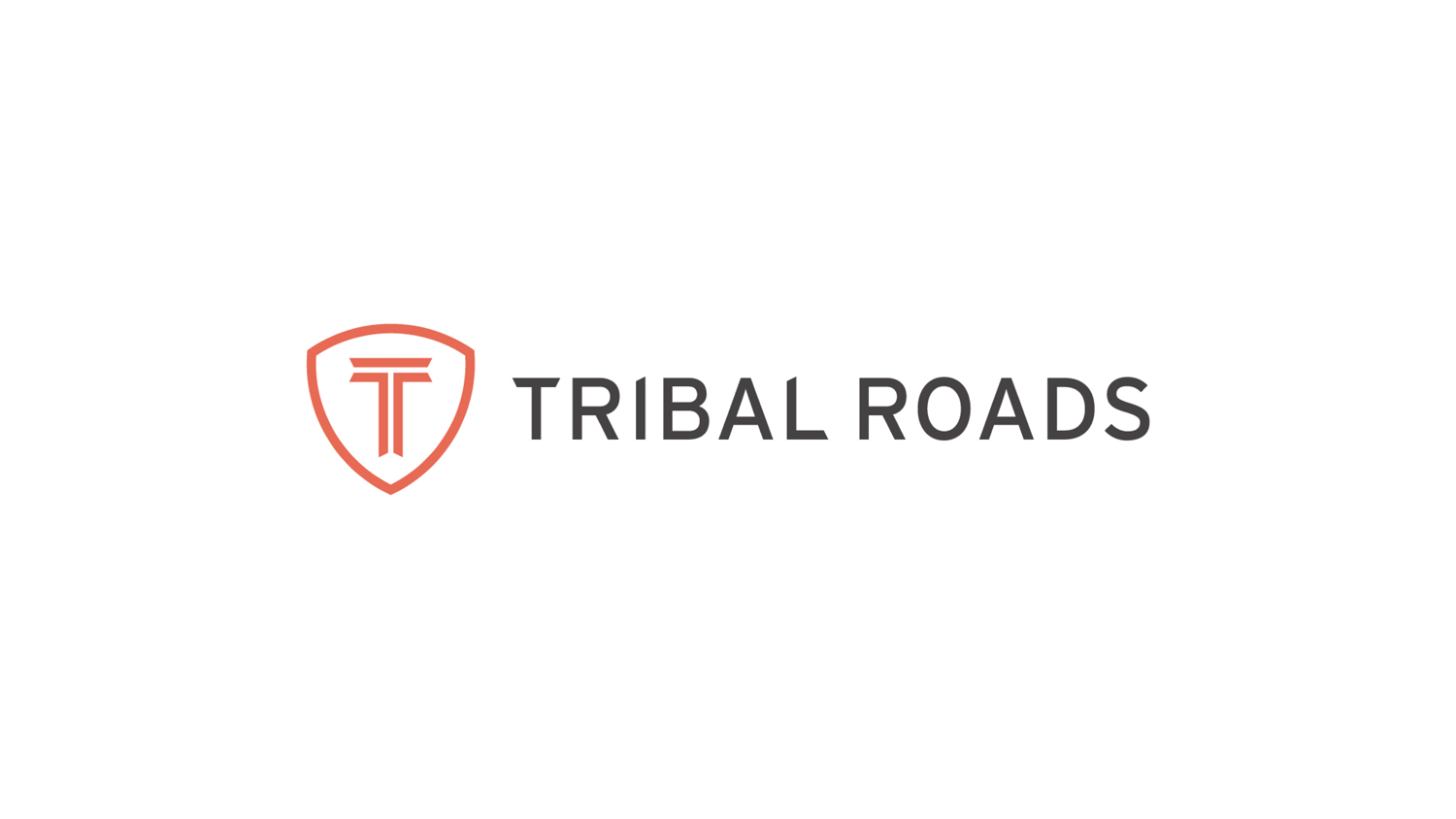
The primary goal in pairing the wordmark and symbol together is to create balance and harmony between the two elements. The font has been weighted to have a uniform stroke width with the symbol. This makes the symbol larger and the most important thing.
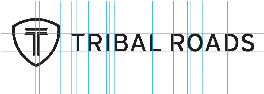
Lockup
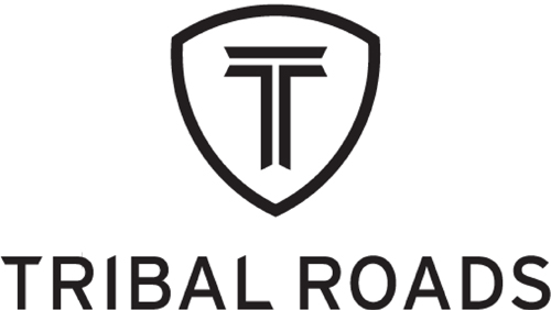
When the logo needs to fit in a space with a vertical aspect ratio,the symbol can move to the top of the wordmark.
In order to achieve balance in this configuration, the name has been scaled down.
Color
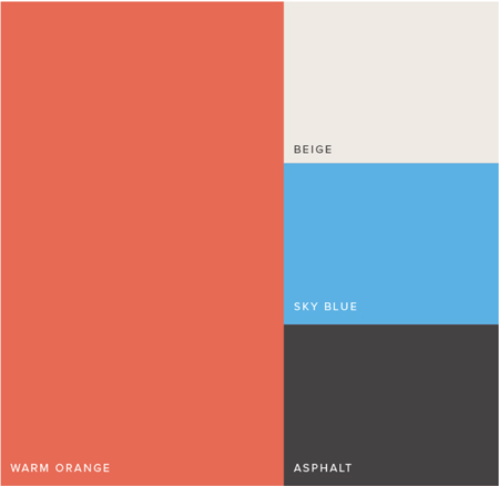
Color plays a key role in creating the proper feeling of a brand. This color palette is inspired by Native American tribal pattern art.
Orange is very fitting in this context as it signals change and improvement. Beige is used as soft neutral when needed. Sky blue is used to draw attention to key actions, like website buttons. And asphalt is used for text and basic elements.
