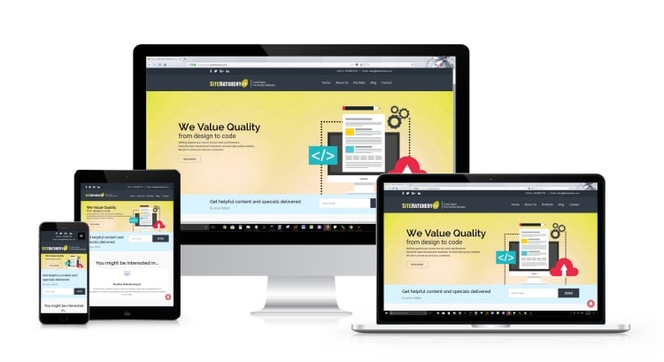
Responsive Websites
Responsive Websites allow your web page to look good, no matter what devices are being used. Whether someone is visiting your website on a cell phone, or a desktop PC. The content is arranged and displayed proportionately to the viewing size of the electronic device. Content is formatted to accommodate the user, allowing visitors who are on a mobile device have the same level of experience as someone who is on a tablet, a laptop, or even a desktop PC. The experience is the same across the board.
Over 50% off your website traffic will come from a mobile device
With the increase of technology and processor speed with mobile phones, people use their personal mobile devices to find information. Studies show that over 50% of web traffic is attributed to mobile devices, in some cases, surpassing desktop PCs. These numbers clearly show that users are comfortable with using their mobile phones when searching for content, and the demand is not going away. Having a website which is optimized for all electronic devices ensures that you are catering to everyone who visits your web page.

Flexibility
Having a website that responds to any view port size eliminates the need for extensive development. Your website can be viewed and used by all devices, regardless of their size, and confidently know the content and material of your website will be arranged, resized, removed, or even replaced.
Performance
With a responsive web design, your website accommodates all viewing port sizes. The website will perform as it should, without having to scroll to the right to see an image, a video, or other content that was intended to be viewed in a different resolution size. Content will be organized, prioritized and resized, to fit the needs of each electronic device.
Experience
When your website responds to the visitors device, they can easily navigate through your website. All the content is sized for the users viewport, and all they need to do is scroll. There’s also the addition of a responsive menu, which allows the visitors to easily jump around your website by having the menu easily accessible. Websites that are responsive and cater to the experience of their visitors. By doing so, visitors will stay on the site longer, view more pages and have a higher conversion.